
Clare McNally gave another class to students at DMJX Creative Communication about Art Direction "do's and don'ts". Here are just two of the many bits of advice covered in the talk ...
- Google it
Students are free to push boundaries and play with new ways of thinking and doing — so, the last thing you want in your portfolio is a rehashed 'copy' of a Cannes Lion winner from 2003. Or worse, a campaign that just launched. Ouch. So, always do a google search in words and images. It is still the best way to check that you don't unintentionally make a copy of existing work.
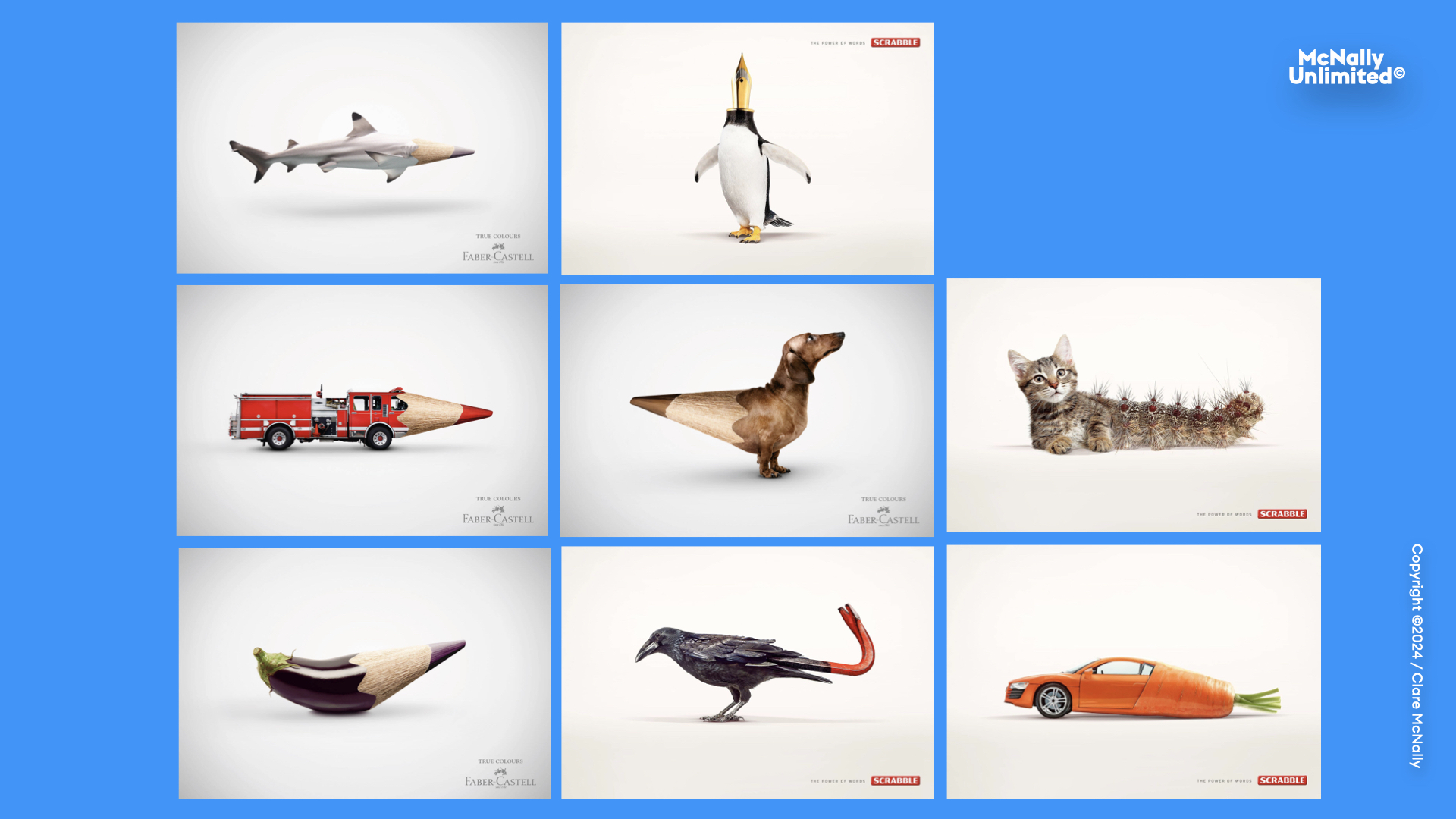
And, if you don't believe this matters, just look at this slide. It is two, different brands.
And yes, even professionals often even skip this step. Probably out of fear they might actually find something (we all know the feeling and it's not great). However, it is ALWAYS better to know your idea's been done and move on than to have a CD point it out in a review, or troll you on LinkedIn.
2. Play with visual hierarchy
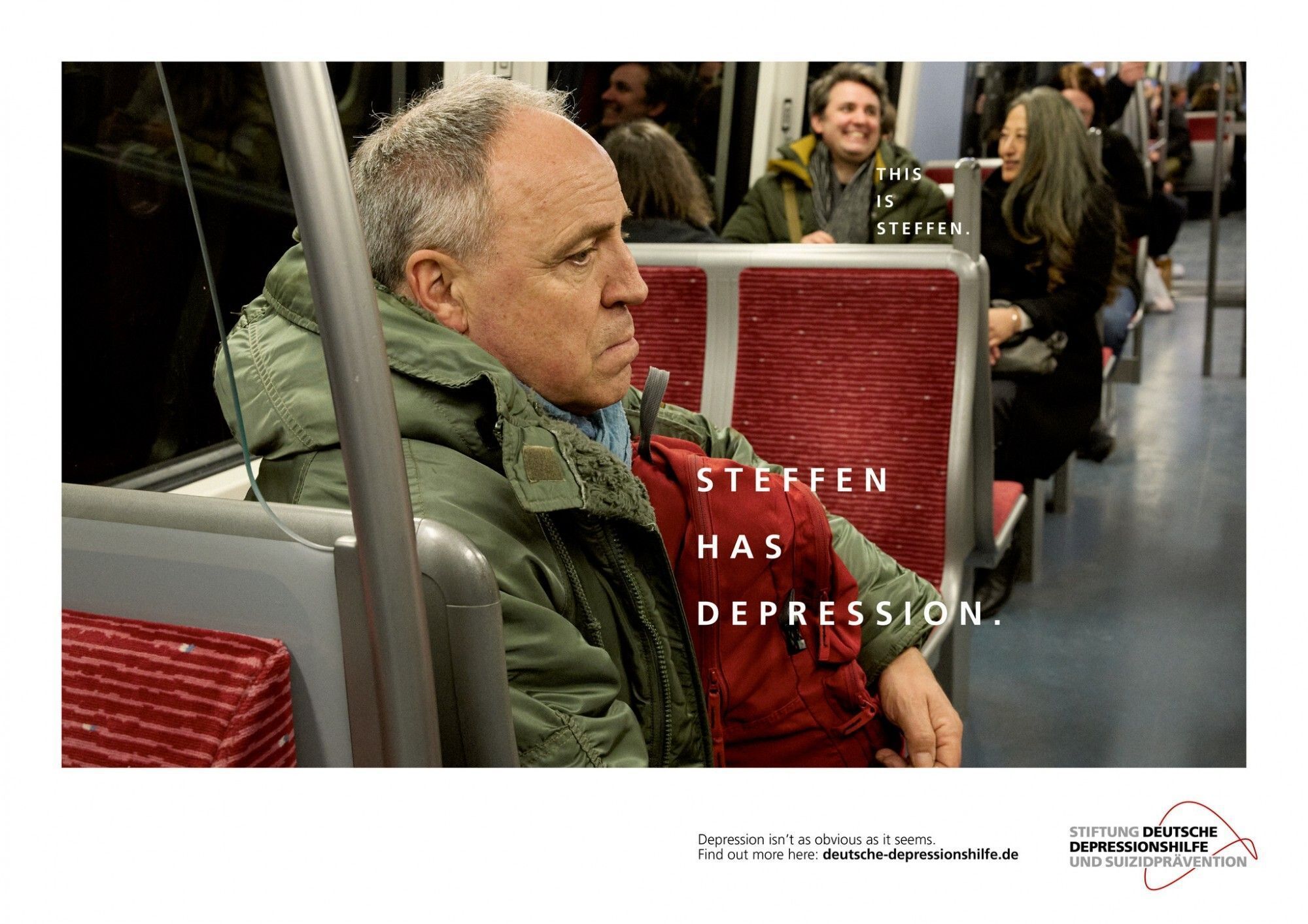
Many ad campaigns follow a pretty formulaic structure, especially print and poster — the classic "portrait format" with a headline, image, body copy and logo. Yawn. This expected order is a great place to start, but you can experiment with visual hierarchy to help your work stand out and enhance impact. Heirarchy can even be your idea, as in this powerful mental health campaign ...
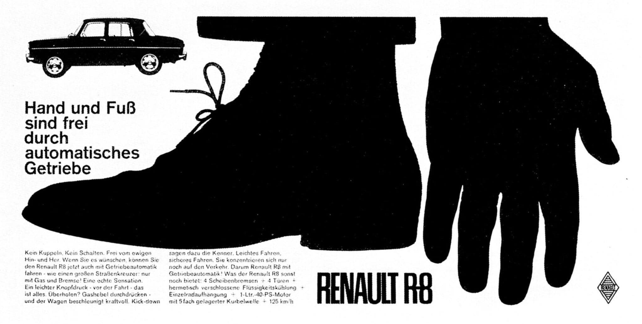
And, below is another wonderful example of playing with visual hierarchy. The product, Renault, is the smallest visual which breaks convention to get attention. The headline reads: "Hands and feet are free thanks to the automatic transmission". Beautiful.
- The talk "Advice for Art Directors" is given to 1st-year Art Directors as part of Cathrine Understrup's course at DMJX.